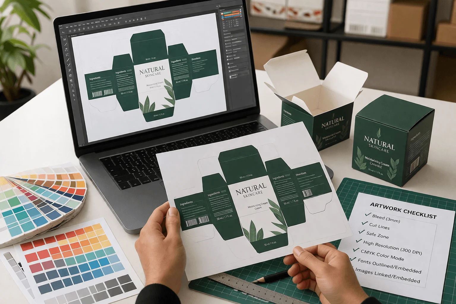
The boxes are ordered. The material is selected. The deadline is set. And then production stalls because the artwork file isn't print-ready. It happens on roughly 3 out of every 10 first-time custom packaging orders. A logo pulled from a website at 72 DPI. Colors built in RGB that shift when converted. Text placed right on the fold line that cracks and distorts after assembly.
These are not design problems. They are file preparation problems, and every single one is avoidable. The Printing Industries of America reports that prepress errors remain one of the leading causes of production delays and cost overruns in commercial print. Knowing what your print partner needs before you submit files saves time, money, and the frustration of reprints.
This guide breaks down every step of artwork preparation for custom packaging boxes, from file formats to finishing layers, written specifically for brand owners and marketing teams working with a packaging supplier for the first time.
Best File Format for Custom Packaging Artwork
Vector Files: The Industry Standard
What is a vector file:
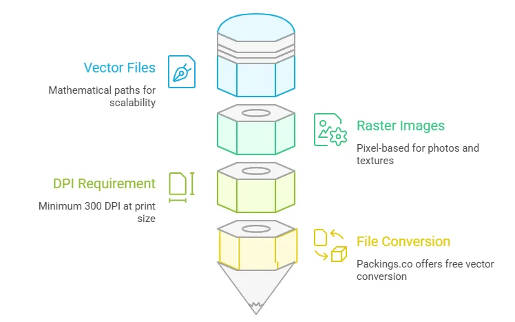
A vector graphic uses mathematical paths instead of pixels. It scales to any size, from a 3-inch tuck end box to a 24-inch shipping container, without losing a single point of sharpness.
The preferred formats are Adobe Illustrator (.AI), Encapsulated PostScript (.EPS), and press-quality PDF. These preserve layers, colors, and scalability. If your logo was professionally designed, ask your designer for the original vector source files. They should have AI or EPS versions on hand.
When Raster Images Work and When They Don't
Raster files like JPG, PNG, and TIFF are pixel-based. They work for photographs and textured backgrounds but they cannot scale up cleanly. A 500-pixel logo from a website header will look fine on screen but will print blurry on a box every time.
The rule: any raster image must be at least 300 DPI at the actual print size. A file that is 300 DPI at 2 inches wide is only 150 DPI if you stretch it to 4 inches. Resolution drops as size increases.
If you only have a PNG or JPG of your logo, the design team at Packings.co can convert it to vector at no extra charge. This is included with every order.
CMYK vs RGB: Getting Print Colors Right
Why Screen Colors Don't Match Print Colors:
Screens display color using RGB (red, green, blue) by emitting light. Printers produce color using CMYK (cyan, magenta, yellow, black) by absorbing light. These two systems have different color ranges. A design that glows on a monitor can print flat or muddy if the conversion happens at the printer instead of on your end.
The most affected colors are bright blues, vivid purples, and neon greens. These exist in the RGB spectrum but fall outside what CMYK ink can physically reproduce. The software shifts them to the nearest printable alternative, and the result rarely matches what was expected.
How to Set Up Colors Correctly?
Set the working file to CMYK from the start:
If photos or textures were originally saved in RGB, convert them manually in Photoshop or Illustrator before submitting. That way the actual printed colors are visible on screen during the design phase, not after boxes are already produced.
For exact brand color matching, use Pantone (PMS) spot colors. PMS inks are pre-mixed to a specific formula, so the printed result matches the swatch book precisely. This is critical for logos where color consistency across different print runs and different box styles matters.
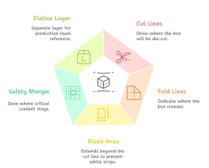
What Is a Dieline in Packaging?
A dieline is a flat structural template of a box:
It shows every panel, fold line, glue tab, and flap laid out in two dimensions. The packaging supplier provides it based on box style and dimensions. Artwork is placed within the dieline boundaries.
Understanding Dieline Lines and Zones
There are four key elements on every dieline:
Cut lines (usually solid) show where the box will be die-cut. Keep all text and critical design elements at least 0.125 inches (3mm) inside cut lines. Anything closer risks being trimmed off.
Fold lines (usually dashed or red) indicate where the box creases. Avoid placing important text or fine details directly on fold lines because the crease can distort or crack them.
Bleed area extends beyond the cut line, typically by 3mm on each side (this may vary slightly by supplier). If a background color or pattern runs to the edge of the box, extend it to the bleed line. Without bleed, thin white strips appear along trimmed edges.
Safety margin is the zone 3mm inside the cut line where all critical content stays. Logos, product names, barcodes, and regulatory text all belong inside this boundary.
Keeping the Dieline Layer Separate
Never flatten or merge the dieline layer with artwork layers. Keep it on a separate locked layer at the top of the file so the production team can reference it without interference. Flattened dielines cause delays because the printer has to manually separate them before making plates.
Font Setup and Minimum Print Size
Converting All Text to Outlines
Fonts behave differently across computers. If the packaging printer doesn't have the exact font file installed, text can reflow, substitute a different typeface, or break entirely.
The fix:
before saving the final file. In Adobe Illustrator, select all text objects, then go to Type and Create Outlines (shortcut: Shift + Cmd + O on Mac, Shift + Ctrl + O on PC). This turns each letter into a vector shape that prints identically on any system.
Minimum Font Size for Box Printing
Body text should be at least 8pt for forward printing and 10pt for reverse printing (light text on a dark background). Thin or light-weight typefaces may need to go even larger. Fine serif fonts at small sizes tend to break up on corrugated and kraft substrates where the surface texture is rougher than coated paper.
How to Set Up Spot UV, Foil, and Embossing
Creating a Separate Layer for Each Finish
If the box includes finishes like spot UV, foil stamping, embossing, or debossing, each finish needs its own dedicated layer. The production team uses these layers to create separate plates or masks for each process.
Create a duplicate artboard showing only the areas where the finish applies. Use a separate named spot color (for example, name it "Spot UV" or "Gold Foil") rather than standard CMYK black. This eliminates ambiguity and ensures the production team knows exactly which elements receive which treatment.
Labeling Layers for Clean Production
Label every layer clearly: "Spot UV," "Gold Foil," "Embossing," "Outside Print," "Inside Print." Poorly labeled or merged layers are one of the top causes of production delays and sometimes trigger reprint charges. Taking five minutes to organize layers can save five days in the production queue.
Five File Mistakes That Cause Costly Reprints
These are the errors that account for most reprint requests and timeline pushbacks. Avoid them and the first submission goes straight to production.
- RGB instead of CMYK is the most common color error. The file converts automatically at the printer but color shifts catch clients off guard after boxes are already cut.
- Low-resolution images at 72 or 150 DPI instead of 300 DPI produce soft, pixelated prints. Upscaling a low-res file in Photoshop adds pixels but does not restore detail.
- No bleed extension leaves white edges on boxes that are supposed to have edge-to-edge color coverage.
- Text too close to fold or cut lines results in trimmed or distorted content that makes the finished box look unprofessional.
- Fonts not outlined causes substitution errors that change typography entirely, sometimes swapping a premium brand font for a system default.
Quick Checklist Before Sending Files
Before uploading artwork to any packaging supplier, run through this list:
File format set to AI, EPS, or press-quality PDF. Color mode is CMYK (not RGB). All images are 300 DPI at actual print size. Bleed extends 3mm beyond all cut lines. All fonts are converted to outlines. Dieline is on its own locked layer, not flattened. Finishing layers (spot UV, foil, embossing) are named and separated. Text and logos are inside the safety margin, at least 3mm from cut and fold lines.
If every box is checked, the file is production-ready.
Get a Free Print-Readiness Check on Your Files
Not sure if your artwork meets these standards? Upload your files and our design team will run a full print-readiness check within 24 hours. No commitment required. We flag any issues, adjust settings, and prepare everything for production at no extra charge. Free dieline setup and unlimited revisions are included with every custom packaging order.
Avoid costly reprints and delays. Send your files for a free artwork review today.
FAQs
Q: What is the best file format for packaging artwork?
Vector files in AI, EPS, or press-quality PDF. These scale without quality loss and preserve layers. Raster images work only if they are 300 DPI at actual print size.
Q: What happens if I submit artwork in RGB?
Colors shift during automatic conversion to CMYK. Bright blues and neon greens are hit hardest. Convert to CMYK yourself before submitting so there are no surprises after production.
Q: What is a dieline in packaging?
A dieline is a flat template showing the exact layout of a box, including cut lines, folds, and bleed areas used for printing and production. The supplier provides it based on box dimensions.
Q: Do I need a designer to prepare my files?
No. Packings.co offers free design support with every order. Send a logo and brand colors, and the team handles file setup, dieline placement, and color matching at no cost.
Q: What is the minimum resolution for printing?
300 DPI at actual print size. A file that is 300 DPI at 2 inches drops to 150 DPI if stretched to 4 inches. Always check resolution at the final output size.
Q: How do I set up foil or spot UV layers?
Create a separate layer for each finish using a named spot color (not CMYK black). Place it on a duplicate artboard and label it clearly so the production team applies each effect to the correct areas.